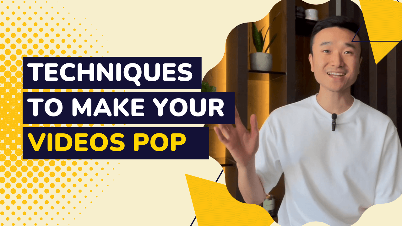
Hello again, welcome back, and today I want to show you some of the visual design techniques I use to keep my videos interesting. Now, the great thing about this type of content is I can turn on my phone and talk into the camera, and it doesn’t take me very long but it can get boring pretty fast if I’m just staring in the camera talking for 2 or 3 minutes, and so there are a number of visual design techniques that I use to keep my videos interesting.
The first one I want to talk about one that I’m sure you’ve seen before is called the lower third. The lower third is a great way to introduce the speaker or introduce yourself with your name and give context as to what your job title is. And it’s often just a nice visual element that shows up, and then goes away near the beginning of your video.
Another design you’ll notice in many of my videos is called a callout and a callout is a great way to highlight key concepts. And I always use highlights to make sure that the viewer knows what the key takeaways are.
There are times when I want to show something. When I want to show something I use what is called, the cutaway. The cutaway, as the name suggests, cuts away from the speaker and into a new footage, and this could be a clip of something you want to show, it could be stock media to set the mood. And then once you’ve made your point, you cut back to the speaker. And a variation of the cutaway is the title card. I’ll often use title cards to separate my video into different chapters. Or if I really want to highlight a key piece of information, I would use a title card to highlight a statistic, like this.
There are also times when I want to show something but I don’t want to disconnect from the audience, so I want the best of both worlds. And in those cases, I use a split screen. With a split screen. I can show a footage or a clip while staying on the screen and talking to the audience, or similar to the title card, I can use a split screen to include bullet points to show multiple points that I’m trying to communicate.
As you’ll see in many of my videos. I mix and match these different elements and different designs to keep my videos interesting. So that you can watch me talk for two minutes without getting bored. The process doesn’t take me very long but it’s very effective at keeping engagement. And personally I use Lumen5 to add all these designs. And if you’re interested, I can do more of an on-screen tutorial as one of my future videos as well, and hopefully, this video gave you some ideas on how to make your videos more interesting and I’ll see you in the next video.


